
Logistics
Our project framework
Duration
2 weeks
Team
Team of 5
Role
Deliverables
Overview
A two-week sprint to reimagine the enrollment process
The UCI University Registrar reached out to the UCI ANTrepreneur Center to conduct research and design solutions to help improve the current website and course registration process. During a two-week period hackathon, students work in teams to build a prototype and pitch a presentation to judges — some of whom work for the UCI University Registrar.

Team Photo!
Problem
An outdated system where students had to create workarounds for themselves
The UCI WebReg is an outdated course registration site, which has caused many frustrations and inefficiencies for students during the enrollment process.
💡
Comparative Analysis
Reliance on 4+ different sites to plan course schedules every quarter
Our team compiled a list of various existing websites that we wanted to reference. These are all very common resources UCI students utilize during the course registration period. But why is it that students had to access and gather information from multiple platforms in order to plan their schedules?
I created a list of notable features from each of these sites since these would be important to note when brainstorming features for our redesign.
📰
General Catalogue
(course catalog)
Course descriptions
Course prerequisites & restrictions
Course unit value
🗓️
AntAlmanac
(schedule planner)
Calendar view of course schedule
Calendar view of final exam schedule
Allows for multiple schedule views
Integrated map view of campus with directions
🗓️
ZotCourse
(schedule planner)
Calendar view of course schedule
Calendar view of final exam schedule
Integrated instructor ratings
Integrated instructor grade distribution
Able to import schedule into Google Calendar
Print, Save, Export schedule
What WebReg currently offers is minimal.
📝
WebReg
(enrollment system)
Modify course schedule (add/drop courses)
View course capacity (availability)
Join course waitlist
Modify grading option or unit value of a course
Survey Findings
Students were frustrated from losing their progress in the midst of schedule planning
The hackathon required all the teams to send out surveys to UCI undergraduate and graduate students. We helped collect 669 responses in total. Since every team was working to address the same problem, it became a matter of analyzing the huge amount of data and formulating solutions within our own team.
These were the key research findings that I compiled from the data.
RESEARCH HIGHLIGHTS
⭐
Average Rating
2.56 out of 5.00
🖱️
Use Frequency
89% of students have used WebReg 10 or more times
➡️ That is a high percentage of returning users
📱
Mobile Friendly
On a scale of 1 to 5, students rated 3.94 on the importance of a mobile-friendly design
🖥️
Most Preferred Features
Integrate Schedule of Classes*
Waitlist Notifications & Status
Schedule Planner
More Efficient Queue
Search Bar
Live Chat Support
*Schedule of Classes is UCI's course catalog
STUDENT DEMOGRAPHIC

Student demographic for 669 survey participants
HEAR FROM THE STUDENTS

USER PERSONA

Design Principles
Introducing changes to a deep-rooted process
Based on our user research, we decided to focus on 4 design principles that supported our users and stakeholders.

User Flow
Visualizing a smoother enrollment process
Creating a user flow provided an overview of the navigation of the site, which is divided up into three main parts: Catalog, Planner, Enroll.

Ideation
Brainstorming features to include and layouts on paper
Early on, I worked on providing sketches of the site layout on paper. This was immensely helpful for myself and the team as it helped us visualize the steps in the user process and address any problems early on.
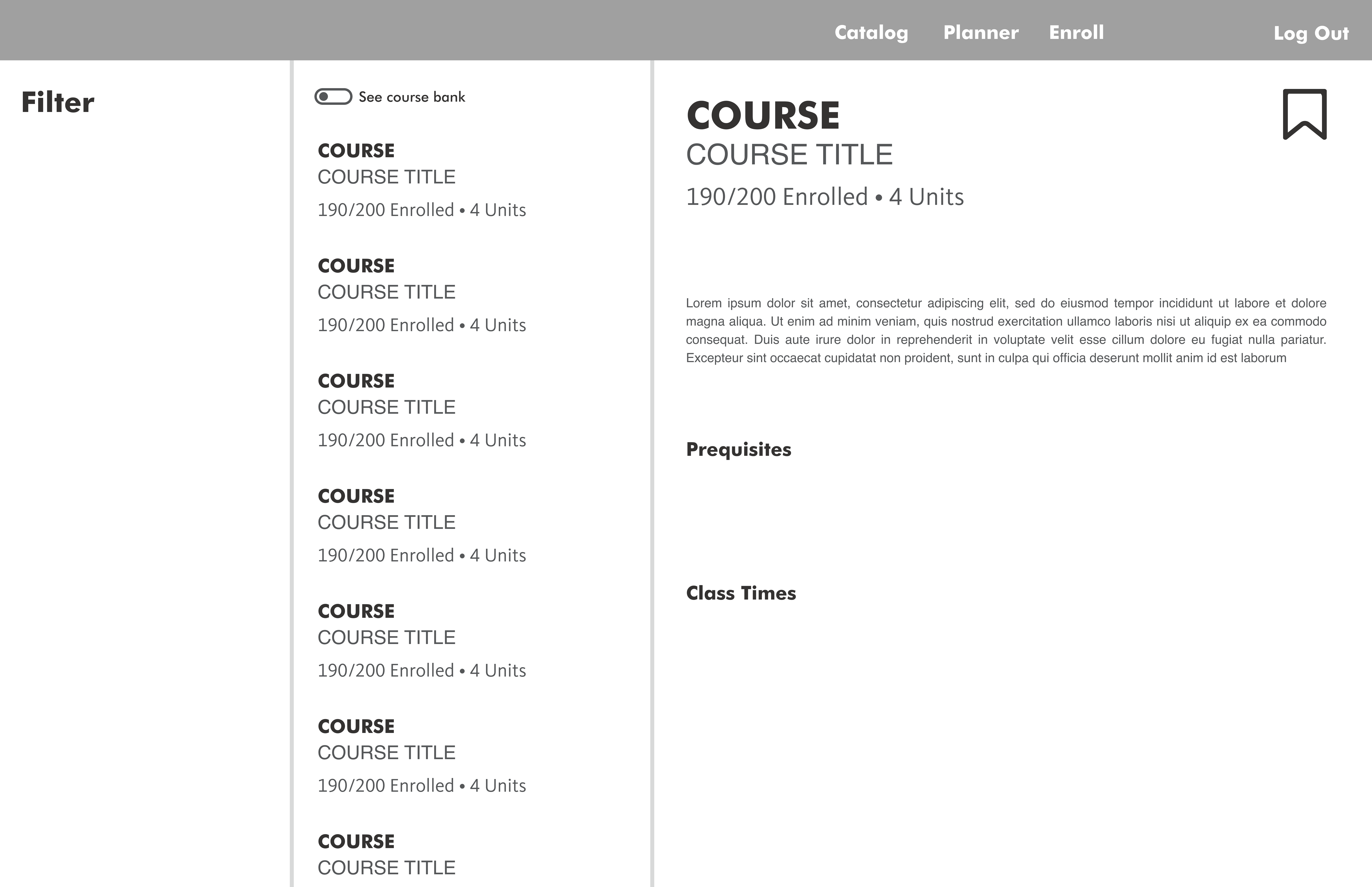
1 - CATALOG

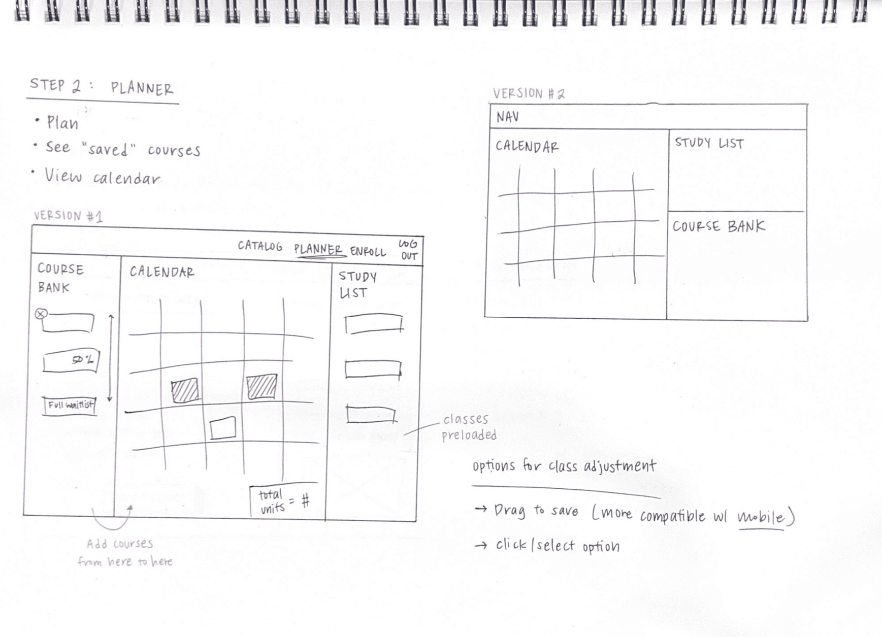
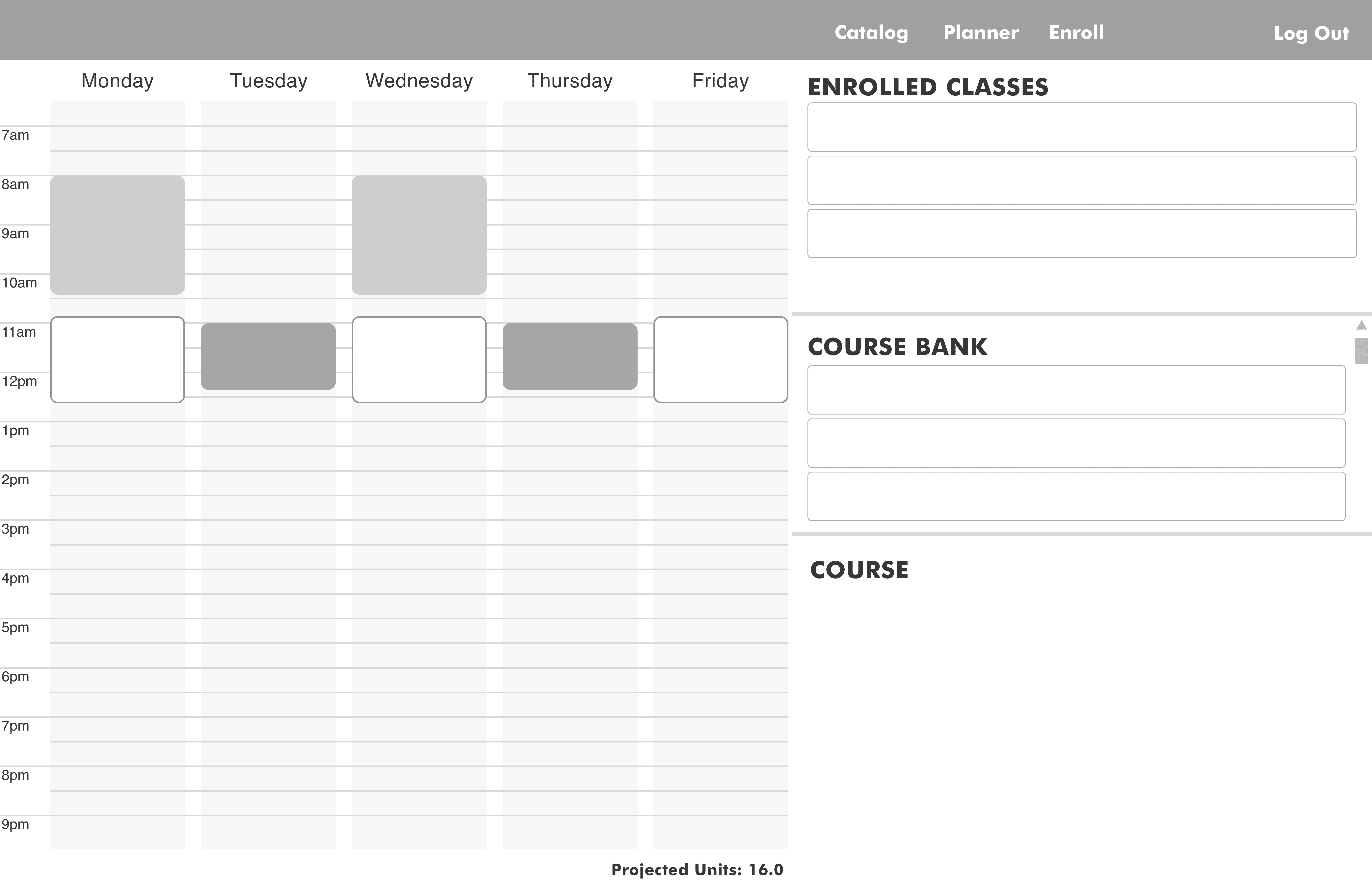
2 - PLANNER
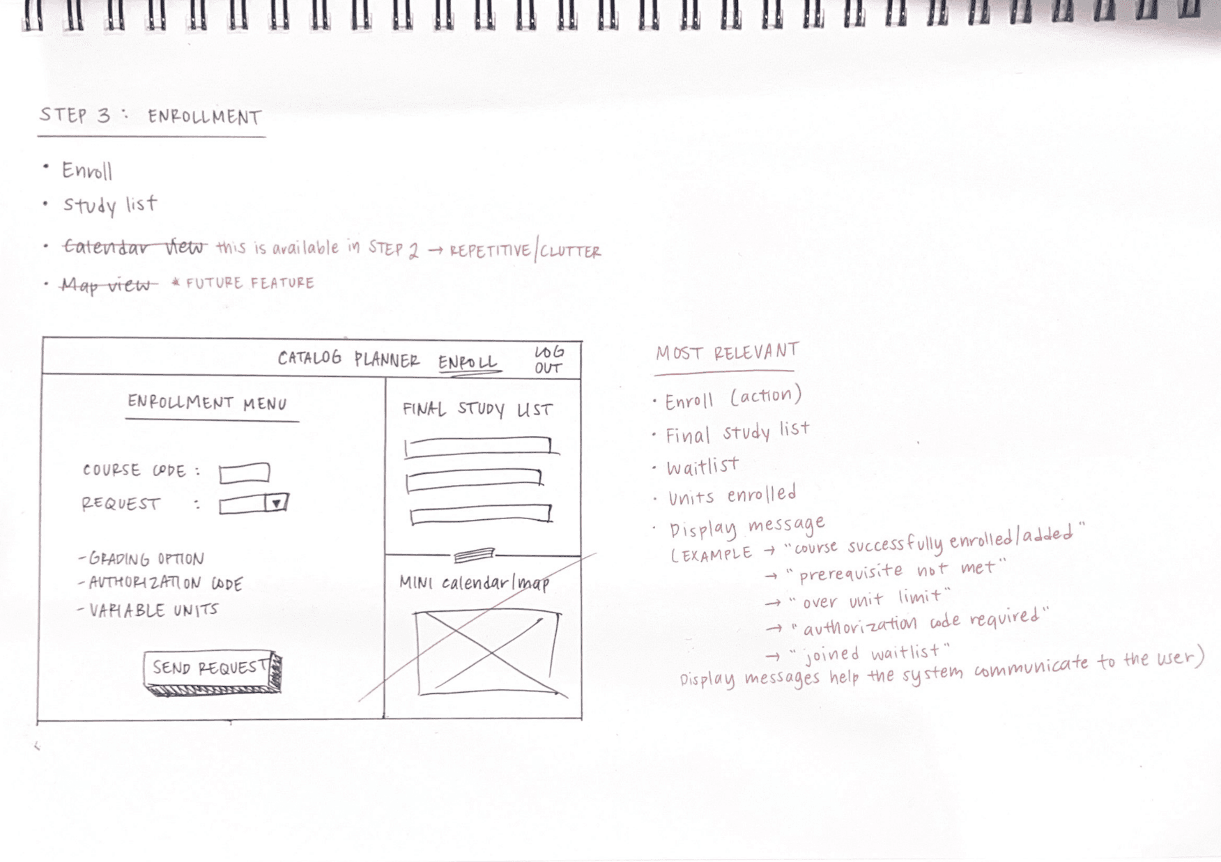
3 - ENROLL
Low-Fidelity
Laying the foundation with wireframes
1 - CATALOG
2 - PLANNER
3 - ENROLL
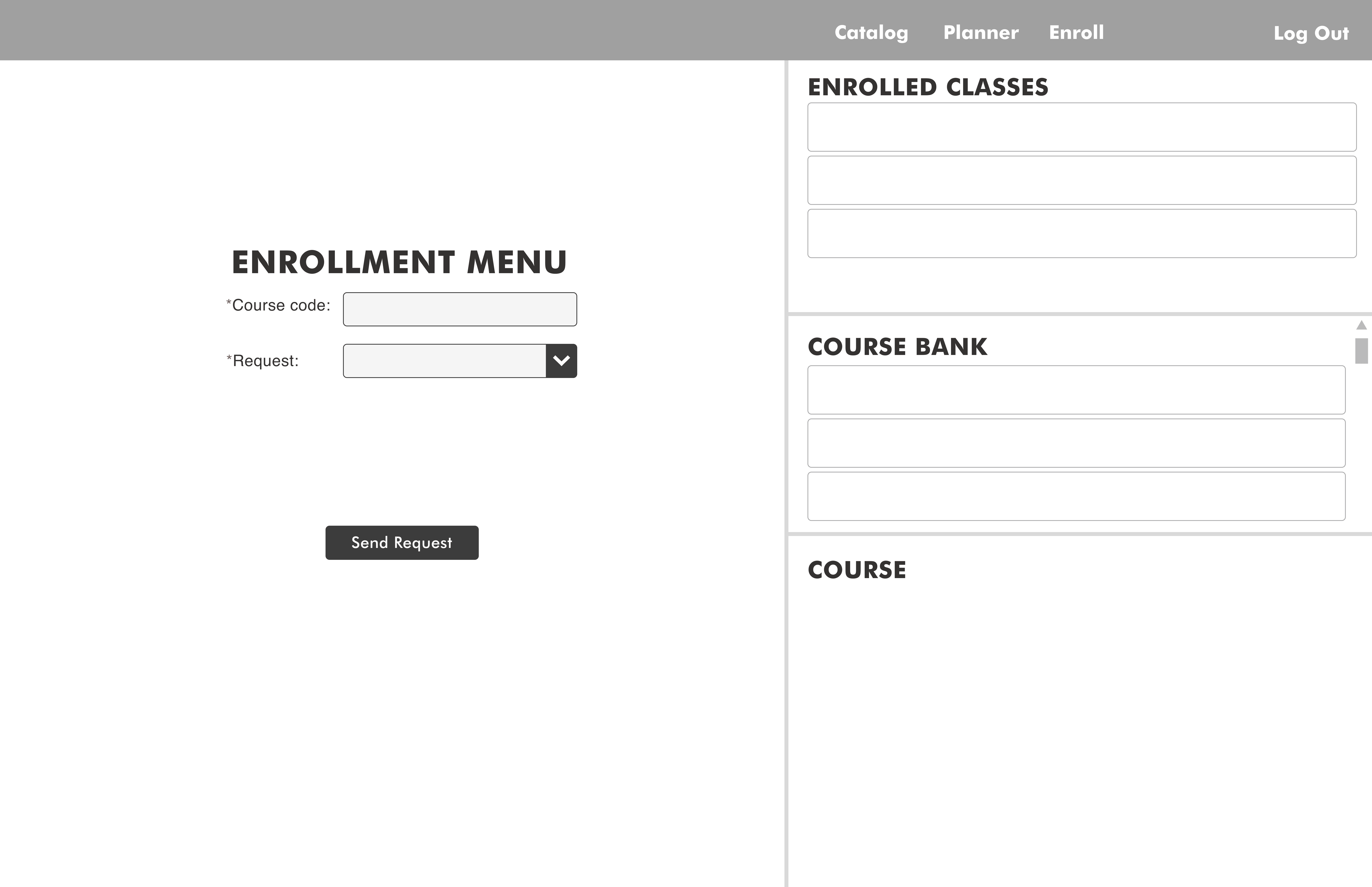
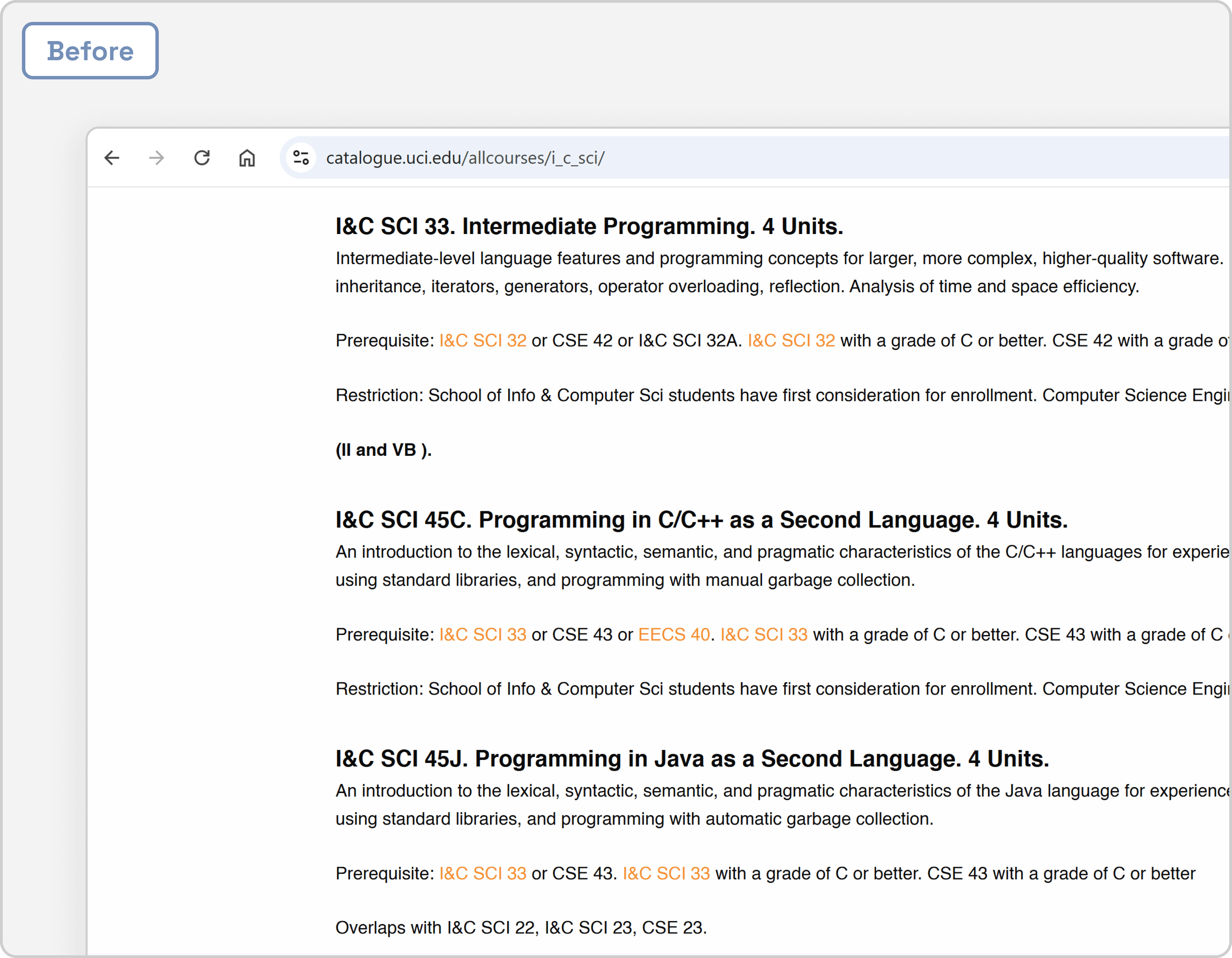
Before & After
Addressing pain points with thoughtful design decisions
1
Integrated Panel View
Previously, all these enrollment-related resources were their own sites.

Consolidating everything into an all-in-one platform resulted in
Reduced toggling back and forth between resources
Better handling of high volumes of information
Structured workflow for the user during the enrollment process
Adjustable, responsive panels offer flexibility and customizability
Accessible, convenient, and time efficient

2
Accordion
Within the course catalog, having the entirety of each course and its description displayed was an extensive amount of content — it was overwhelming and a whole lot of scrolling.
Utilizing accordions to organize content about each course resulted in
Ability for the user to control amount of information they want to view at any given time
Reduced scrolling
Clean, simplified view

3
Spacing
The text fields hardly had any spacing in between them and minimal padding. Users are more prone to misclicking the wrong area, especially for mobile usage and when they are on-the-go.

Proper spacing and use of white space contributed to
Improved readability and comprehension
Enhanced scannability
Visual hierarchy to guide the user's eyes through the content

High-Fidelity
Presenting an integrated and simplified enrollment experience
Next Steps
Future considerations for the project
Responsive Design 📱
Students are able to register for courses via PC or mobile devices — and many use their mobile devices for convenience and quick access. We would create a responsive design prototype if given more time.
Course Schedule as Images 📎
It is very common for students to screenshot and save a photo of their new course schedule to reference again. After providing a responsive design of the site, I would consider adding a feature that allows students to download a copy of their course schedule. Providing a compatible format and file type (for both desktop and mobile views) of their course schedule comes in handy for students to set their schedule as their wallpaper!
Launch for Feedback & Reiterate 🚀
Our team only pitched our project to the judges with a short prototype demonstration. The next steps would be to release the prototype to groups of UCI students, gather feedback from their experiences, revise by incorporating the feedback and additional research — and repeat.
Lessons learned
Takeaways to carry with me in my learning journey
Affordances and Signifiers
From my Designlab bootcamp, I learned about affordances and saw how this was heavily applicable and relevant to the outdated UCI course registration site. The current design of the interface is quite flat, and it is difficult for students to recognize affordances.
💡— How can the user distinguish what is a button and what is not? Which buttons are active?
Don't Be Afraid to Change Old Systems
This was a website I had been using so often for the past 4 years in college. So I was eager to tackle issues that I had noticed early on but failed to pursue further. I am glad I participated in the hackathon project during my senior year because this inspired me to not be afraid to question or change old systems. Although the registration site is many years old, that does not mean it has to stay this way if it is not working for its users.
💡 — What issues do I see in the daily products that I use? Why not change it or reimagine improvements to the current system?
Thanks for reading!
⬇️ Check out another redesign project I did for an eCommerce mobile app!
Haul Mobile App Redesign